
Shaping and scaling a new digital experience
From hands-on design direction to leading design quality across Sveriges Radio's digital products
Context
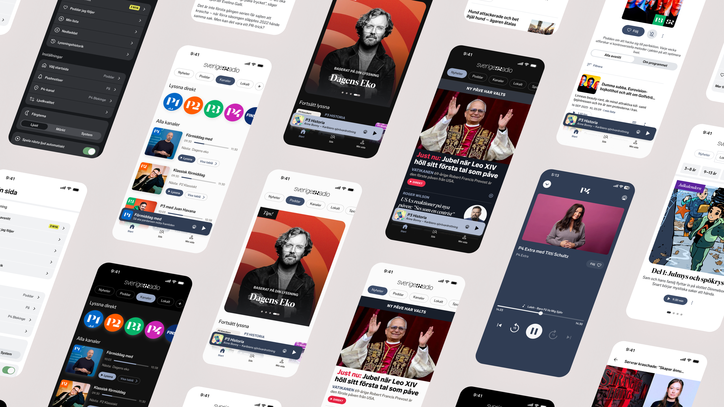
Sveriges Radio brings news, podcasts and live radio together in one digital experience. With different content types, listening behaviours and editorial needs, the challenge was to create a more cohesive and recognisable experience across web and app.
In 2025, I joined a strategic redesign initiative to help establish a new visual and experience direction — one that could bring the products together while giving different types of content room to stand out.
My role
My role has evolved across two phases, combining hands-on design with broader design leadership.
2025 — Shaping the direction
As Digital Art Director, I co-led the redesign alongside another senior design consultant. I developed the core visual foundations — colour, typography, grid and spacing — and defined principles for how the new expression should connect to Sveriges Radio's brand and work across digital products.
My hands-on work focused primarily on news and live radio, where I explored concepts and designed key screens. We divided responsibility across the experience, with my colleague leading much of the podcast exploration.
2026 — Leading the evolution
As Design Lead, I guide design direction and experience quality across product teams. My role is to connect design work across the organisation, identify opportunities for improvement and establish shared principles.
I work closely with designers and product stakeholders to frame challenges, encourage exploration and support teams in developing and delivering solutions — balancing clear creative direction with ownership in the teams.
Framing the challenge
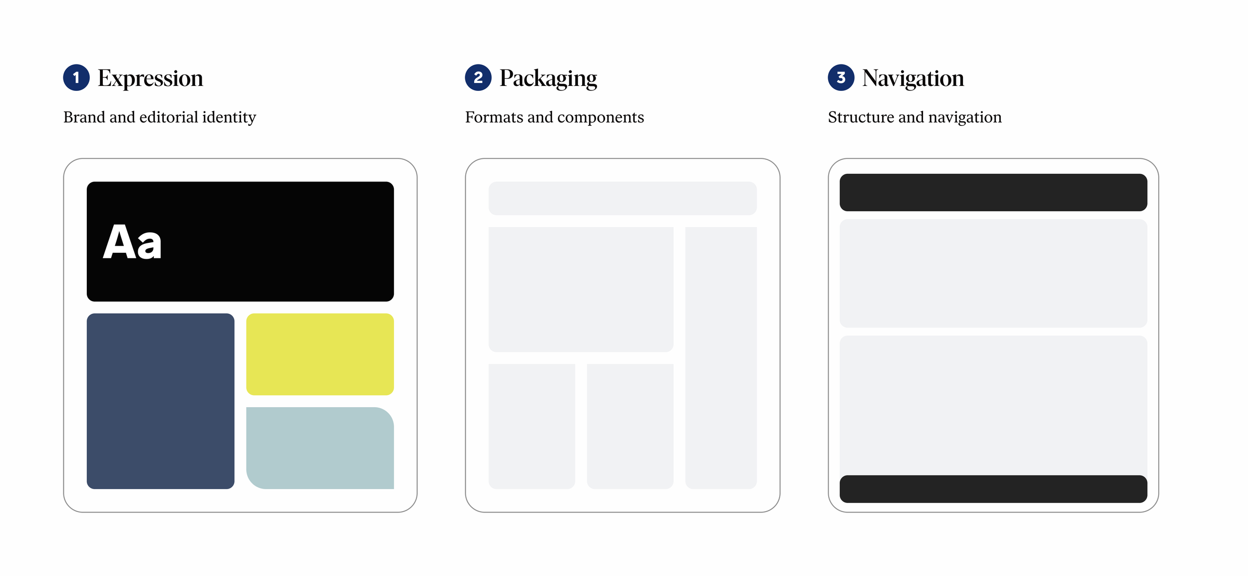
Before exploring design concepts, I initiated and facilitated a workshop with senior leadership to align on the key challenges and opportunities for the redesign.
I translated the discussions into three focus areas to guide the design exploration:
Information architecture & navigation — Clarifying the product offering, the role of news and how users move between content.
Brand expression — Translating Sveriges Radio's brand promise into a distinctive digital experience, with a stronger editorial expression.
Content presentation — Rethinking layouts, formats and visual elements to create a more cohesive and engaging experience.
This gave us a shared starting point for exploring solutions, connecting broader product ambitions with concrete design challenges.
Building the visual foundation
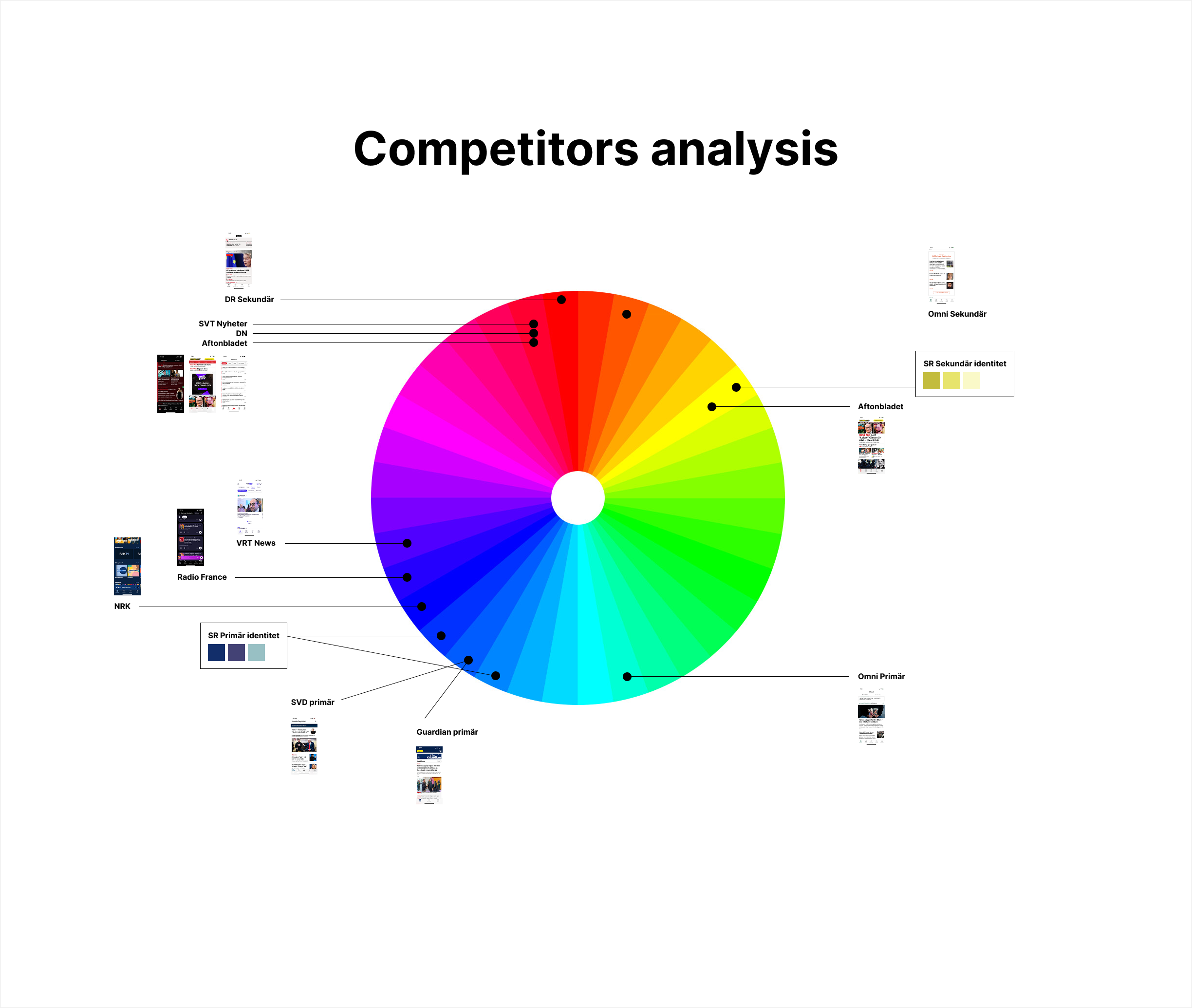
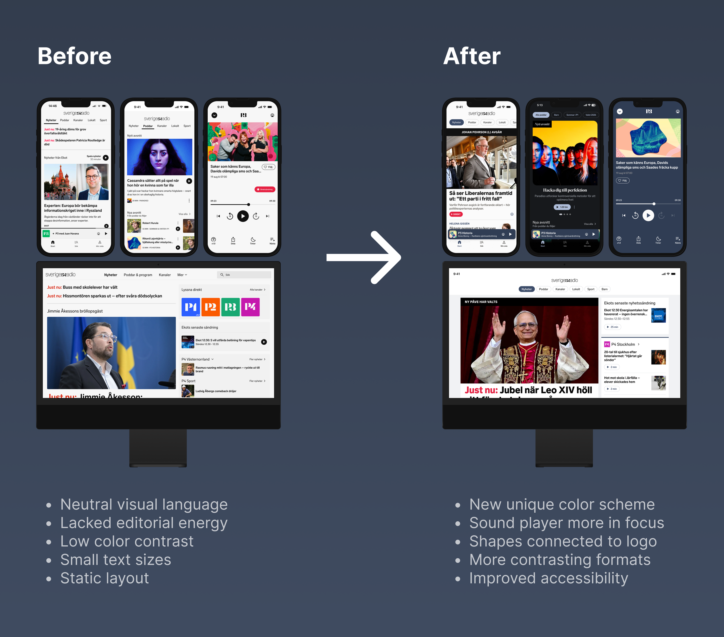
The current SR color system wasn’t made for digital first usage. We identified that as an important problem to solve.
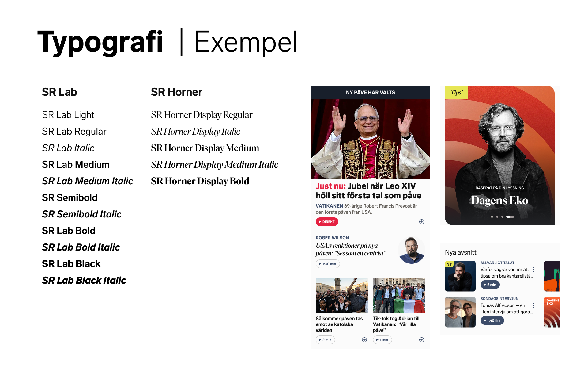
SR already had two typefaces, a serif and a sans-serif. This was a good foundation but adding more weights made it easier to add a unique expression with more possibilities to create contrasts and hierarchy in the layout.
A key challenge was to create a visual language that could work across different content types, platforms and both light and dark modes.
I developed the core colour palette, typography, grid and spacing principles, with particular attention to accessibility and contrast. I also explored how colour and form could reflect the brand's identity and establish a clear visual hierarchy.
Rather than designing individual screens in isolation, the aim was to create a flexible foundation that designers and developers could apply consistently across the product.
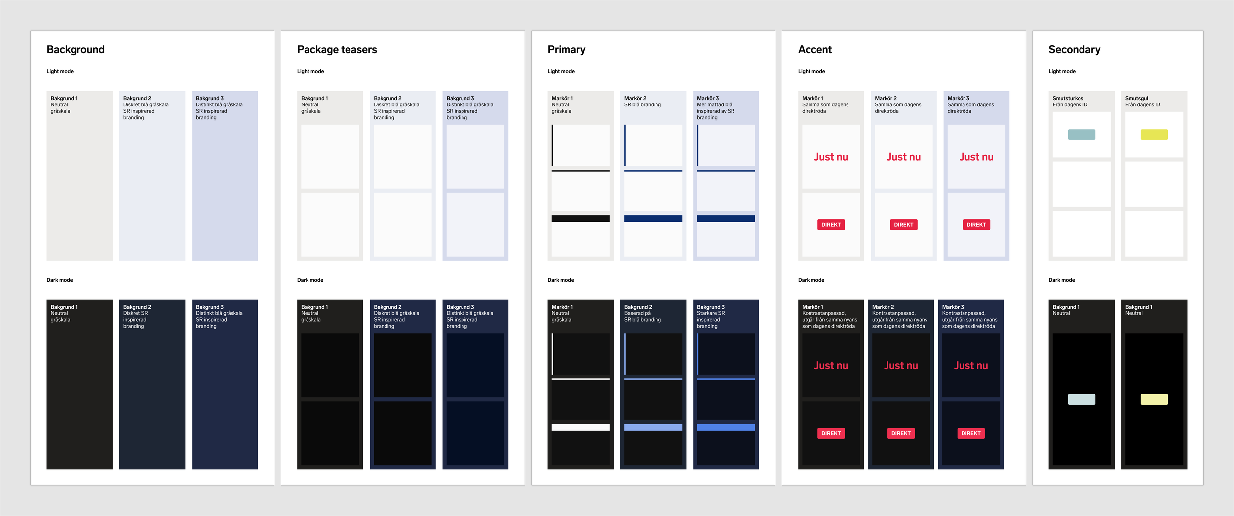
Blue was the obvious color to use, but tweak it to make it work in a digital context. Above are explorations of 3 different tints of blue for shapes and fills. We decided to go forward with neutral tint for large backgrounds and use a less saturated Silver Blue as a new identity color.
Exploring the experience
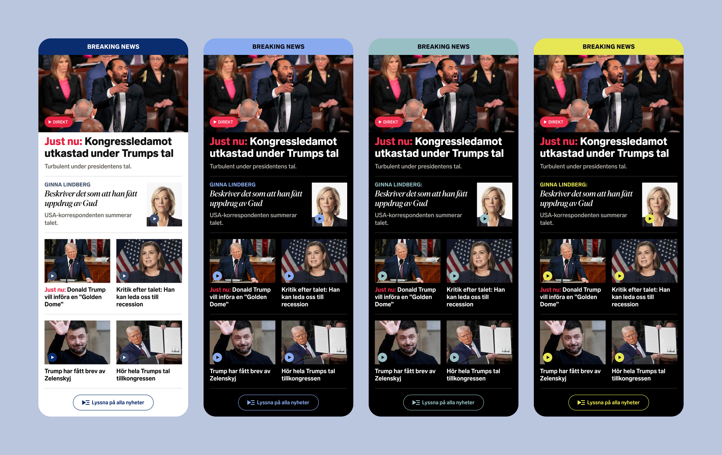
Early concepts explored more saturated colours, but we found that they created an overly tabloid expression and competed with the content. We moved towards a more restrained palette, introducing Silver Blue as a distinctive colour that works across light and dark modes.
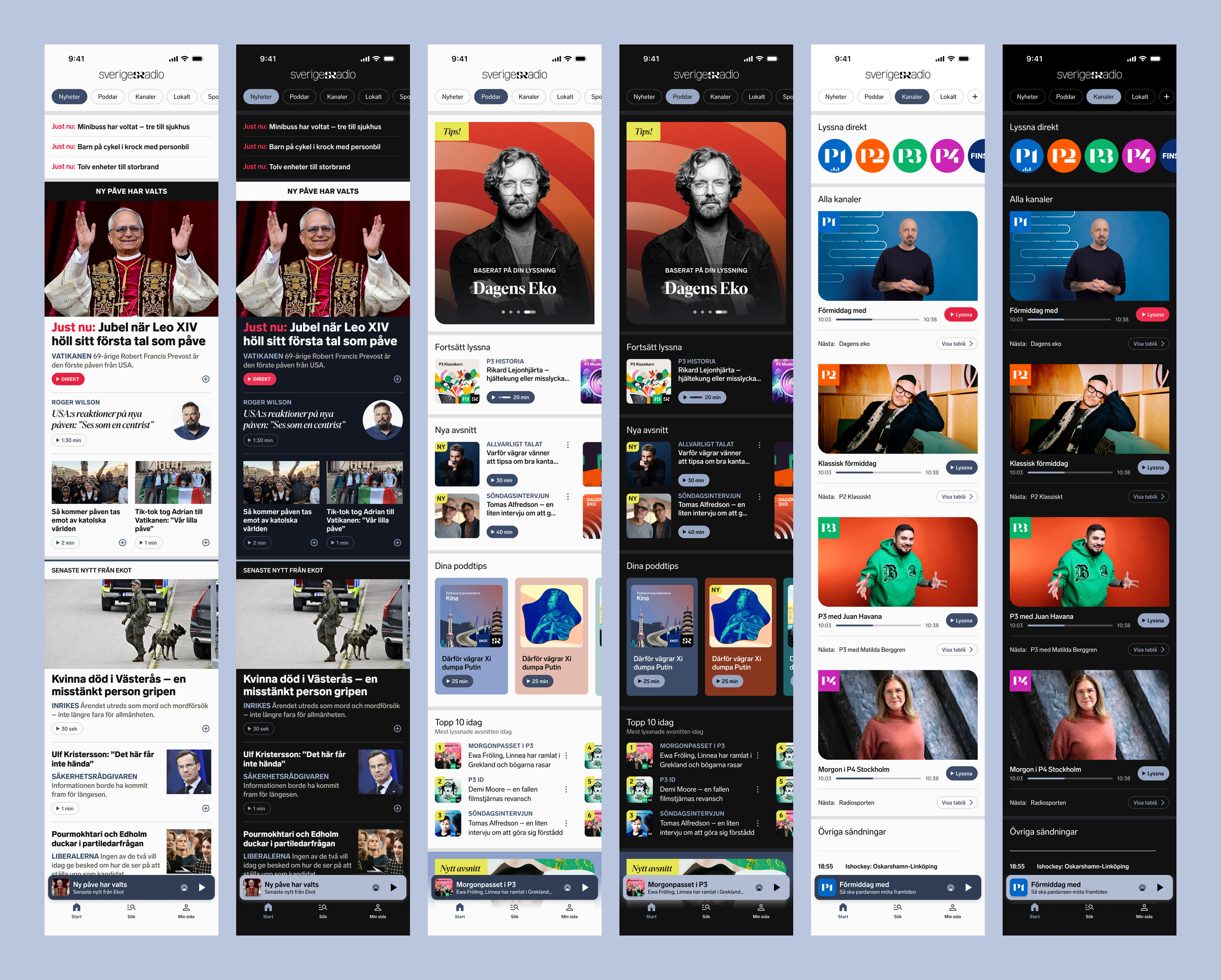
We explored how different content types could share a consistent visual language while maintaining their own character. A combination of straight and rounded image shapes created a subtle connection to Sveriges Radio's logotype.
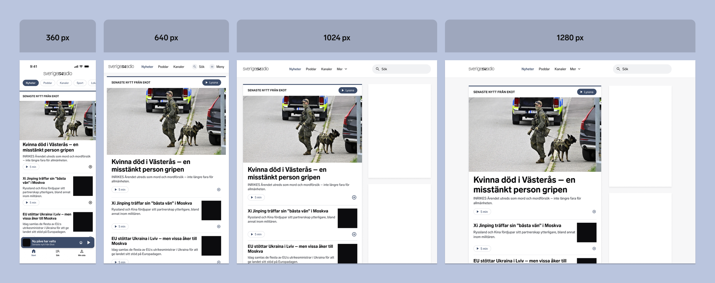
The current breakpoints were used but grid and spacing tweaked to make the layout scalable for both native apps and web site as well as addressing needs for different content types.
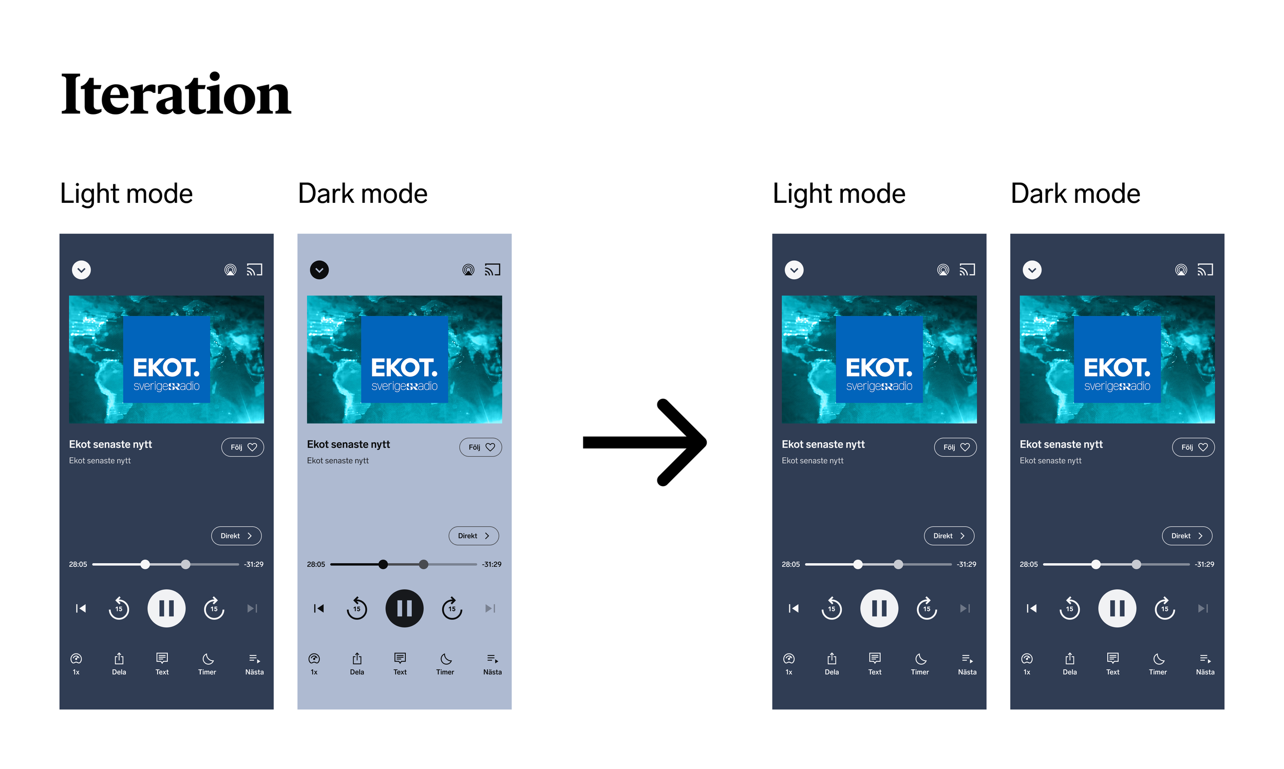
I developed a colour system with accessibility in mind, targeting WCAG AA contrast requirements for text. Insights from users also informed a less intrusive background for the full-screen player in dark mode.
To bring the direction to life, I developed design concepts and key screens, focusing primarily on news and live radio.
These explorations helped establish how typography, colour, spacing and content hierarchy could work together, creating a more recognisable and cohesive expression across different parts of the experience.
Working alongside the other design consultant and product stakeholders, we refined the direction into a shared design language that could be implemented across web and app.
From direction to a live product
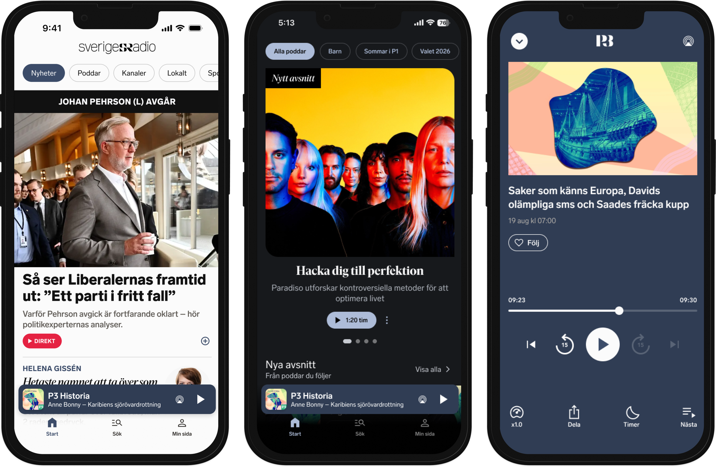
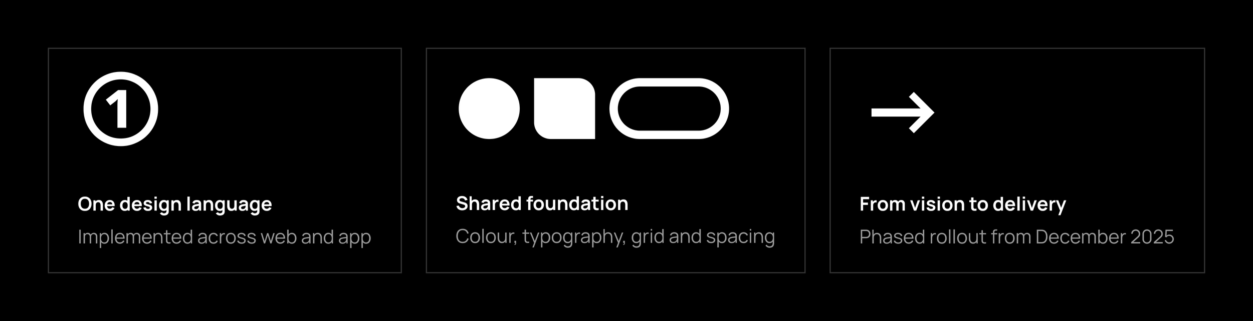
The new design language was introduced gradually, with the first changes released in December 2025 and further improvements rolled out across the following year.
Today, the new visual expression has been implemented throughout the digital experience, supported by shared design foundations and reusable components.
The work has also included an updated navigation structure, informed by usability testing, and a subsequent iOS navigation update adapted to Apple's Liquid Glass design language.
The redesign has evolved through several releases rather than a single launch, allowing teams to build on the original direction while continuing to improve the experience.
Leading the next chapter
As Design Lead, my focus has shifted from shaping the initial design direction to helping product teams evolve the experience further.
I lead our shared design practice, connecting designers across teams through design principles, creative guidance and collaborative exploration. My role is to identify opportunities for improvement, raise design quality and give designers the direction and ownership to develop solutions.
Creating direction, enabling ownership
Evolving navigation on iOS
I helped define the direction for the next iteration of iOS navigation, identifying opportunities to improve the experience while adapting to Apple's Liquid Glass design language.
From there, a product designer took ownership of the detailed design, working closely with app developers to bring the solution into the product.
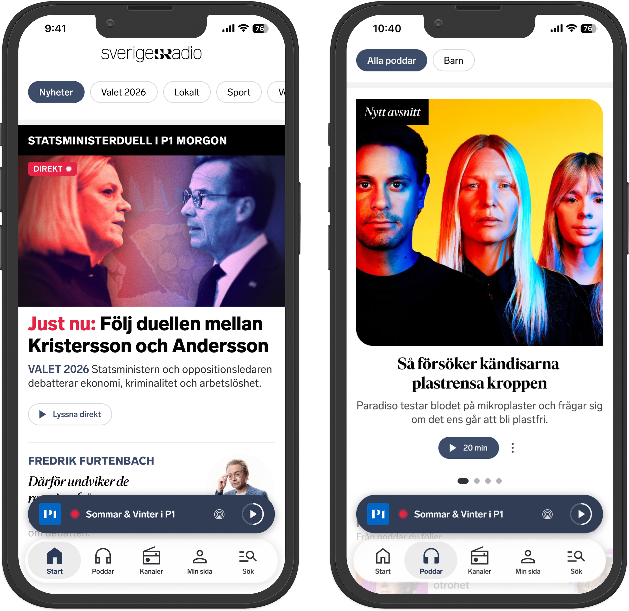
I framed the initial design direction for the navigation update, combining Apple's Liquid Glass with a clearer structure, more rounded shapes and easier thumb access to key destinations. A product designer then developed the solution with the app team, and usability testing helped validate the navigation structure.
Exploring a better live news experience
I introduced a structured discovery approach and facilitated a cross-functional workshop to identify opportunities and frame the key questions for improving live reporting.
The product designer then led the exploration, while I supported the work through research framing, prototype feedback and guidance on user testing.
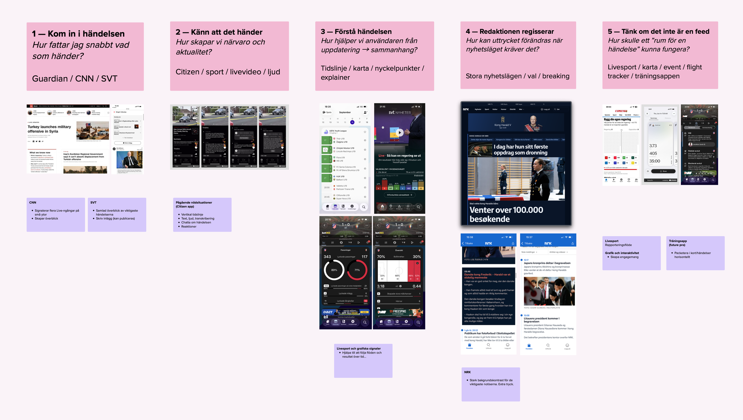
Workshop output mapping five perspectives on live reporting, helping us identify opportunities and frame the questions for further design exploration.
Outcomes & impact
A new expression, brought to life
Co-led a new digital design direction, now implemented across Sveriges Radio's web and app experiences through a phased rollout.
A foundation for consistency and scale
Established the core visual foundations for colour, typography, grid and spacing, enabling a shared design language across platforms and display modes.
A tested navigation structure
Helped shape a new navigation structure, validated through user testing and developed further by product designers and app developers.
Design quality beyond the redesign
Established shared design principles and strengthened collaboration across product teams, helping the experience evolve beyond the initial redesign.
What I learned
This project has given me the opportunity to lead design from two perspectives: first by shaping the experience hands-on, and later by guiding its evolution across product teams.
I've learned that creating a strong design direction is only the starting point. Making it work at scale requires shared principles, continuous collaboration and giving designers the ownership to challenge and develop the original ideas.
The most valuable part has been seeing the direction evolve beyond my own work, shaped and improved by the designers and teams taking it forward.