
Turning a new brand into a scalable digital experience
Translating Tele2’s new brand into product design across web, app and self-service.

Role
Head of UX / Design Director for the initiative
Company
Tele2 — telecom & digital services
Team
UX and product designers across distributed product teams
Focus
Brand-to-product transformation, design direction and design systems

Context
In 2020, Tele2 and Com Hem were brought together under one Tele2 brand. The new identity was bold and distinctive, while the digital products still reflected different legacy brands and experiences.
Our challenge was to translate the new brand into a coherent product experience across web, app and self-service — balancing brand expression with usability, accessibility and conversion.
UX and product design were organisationally part of Brand, while designers worked across cross-functional product teams. My role was to bridge brand and product and create a direction that could scale across teams and digital experiences.
My Role
I led the digital design side of the transformation, connecting brand direction with product needs and technical realities.
My responsibilities included:
Setting the digital experience and visual direction
Translating brand strategy into product design principles
Connecting Brand, Product and Technology around a shared direction
Establishing scalable UI foundations and a shared design system
Staying hands-on in early concepts and key experience decisions

The transformation combined design direction and shared foundations with parallel work on navigation, purchase journeys and logged-in experiences across product teams.
Finding the digital expression
We started by auditing Tele2 and Com Hem's existing digital experiences against the new brand direction. Rather than immediately applying the new identity, we explored how far the digital expression could move while still supporting usability, accessibility and commercial performance.
I helped lead three deliberately different visual directions — from a lighter evolution of the existing experience to more expressive explorations around depth and dark UI.
Testing the directions in real product contexts helped us move the discussion from subjective visual preferences to the role the brand should play in different parts of the customer journey.

The old Tele2 (top row) used more dark backgrounds compared to the old Com Hem (bottom row).

Visual inspiration examples for the North Star work

3 visual concepts emerged: A/ Reliable – light evolution, B/ Neumorph – shadows and highlights, C/ Darkmode – darkblue backgrounds everywhere
Balancing brand expression and usability
The exploration led to a deliberately flexible direction rather than applying the brand uniformly everywhere.

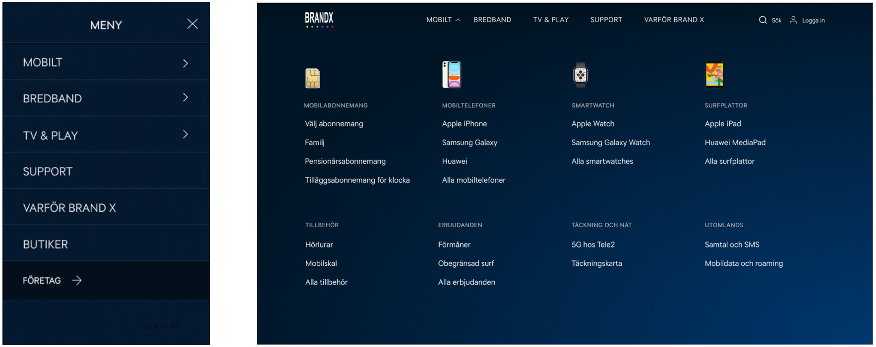

Expressive, darker surfaces were used where brand and inspiration mattered most — such as landing pages and campaigns.
Lighter, functional surfaces supported tasks where clarity, accessibility and conversion were more important — such as checkout, account management and content-heavy pages.
This became an important principle for the wider system: brand expression should adapt to the user's intent rather than compete with it.
Testing the direction in real journeys
We tested the new direction in real product contexts rather than evaluating the visual language in isolation. Navigation, purchase flows, self-service and key interactions were tested with users, helping us understand where the brand could be more expressive — and where simplicity and familiarity mattered more.

We tested accessability and usability of the new visual language as well as interactions and user flows.
Turning the direction into principles

To help distributed teams make consistent decisions without centralising every design choice, we translated the direction into four shared product design principles:
Focus on quality · Build trust · Make it pleasant · Digital frontiers
These became a bridge between brand intention and everyday product decisions across typography, colour, layout, interaction and motion.
Building a scalable product language
The next step was turning the direction into reusable foundations that product teams could work with independently.
We established shared typography, colour, spacing, interaction patterns and core components in Figma — connecting brand expression with accessibility, responsive behaviour and real product requirements.
The goal wasn't simply consistency. It was to make good design decisions easier and faster across teams.

Scaling the direction across the organisation
The transformation involved Brand, Marketing, Product, Engineering and Customer Experience, with different teams responsible for different parts of the journey.
My role was to keep the direction coherent across those boundaries — translating abstract brand intentions into principles, components and reference experiences teams could actually build from.
Working closely with engineering, we used real product flows and technical constraints to ensure the system represented both the desired experience and what could realistically be implemented.


Impact
Brand × product
Translated Tele2's new brand from a marketing identity into a usable digital product language across web and app.
Design capability
Established shared principles and reusable UI foundations adopted by designers across distributed product teams.
Organisation
Created stronger alignment between Brand, Product and Technology around one digital experience direction.
Customer experience
Established a flexible system balancing expressive brand moments with clarity, accessibility and conversion in functional journeys.
What I Learned
A brand needs interpretation, not implementation. Translating brand into product means understanding where expression adds value — and where usability should dominate.
Principles scale better than pixels. Giving teams a shared rationale enabled greater autonomy while maintaining coherence across products.